Elevating Brand Presence Across Platforms: Blog Headers and Social Media Graphics
Overview
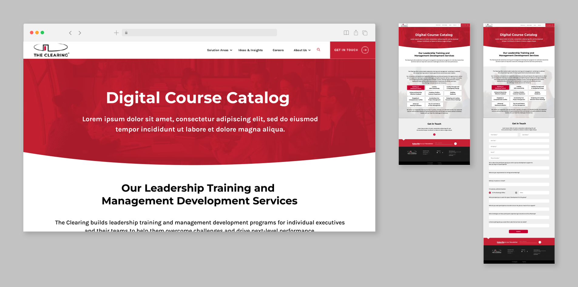
As part of a complete redesign of The Clearing’s Learning and Development department, I created a mockup using Figma for a new digital course catalog splash page. The goal was to develop a user-friendly, visually appealing interface that made it easy for clients to browse, filter, and contact us for potential learning and development courses and training with our professionals. The redesign focused on improving navigation, readability, and overall user experience while maintaining a cohesive brand identity.
This mockup served as a blueprint for the final product, providing a clear visual representation of the layout, typography, and interactive elements. By prioritizing clean design and intuitive functionality, the new course catalog was designed to streamline the learning process and enhance engagement with professional development opportunities.
Design Process
The design process began by meeting with the Learning and Development team to identify pain points and areas for improvement with the previous training site. I collaborated with the team to understand their goals for the redesign, focusing on enhancing usability, accessibility, and visual consistency within the brand. Additionally, I analyzed best practices in e-learning platforms to ensure the new course catalog would provide a seamless and engaging user experience.
Next, I sketched out wireframes to establish the structure and navigation flow, ensuring that users could easily browse the available training opportunities and contact the right team members. Once the wireframes were refined, I transitioned to Figma to develop high-fidelity mockups, incorporating the company’s branding, typography, and color scheme to create a cohesive design. I also designed interactive elements such as hover effects, a dropdown form, and call-to-action buttons to enhance engagement and ease of use.
After completing the initial mockup, I gathered feedback from the Learning and Development team and made refinements based on their input. Iterations included adjustments to spacing, contrast, and hierarchy to further optimize readability and functionality. The final mockup served as a detailed visual guide for our developer, ensuring a smooth transition from design to implementation.
Final Outcome & Impact
Following the implementation of the new design, the Learning and Development department reported a measurable increase in course enrollment and user engagement. Employees provided positive feedback, noting that the catalog was more visually appealing, easier to navigate, and aligned with the company's brand identity. Additionally, the improved structure and design helped streamline content updates, making it more efficient for administrators to manage and update course offerings.
Through this project, I gained valuable experience in designing for usability and accessibility in a digital learning environment. I learned how to balance aesthetics with functionality, ensuring that the design was not only visually compelling but also served a clear purpose in improving the user experience.
Click here to view the finished splash page.